Lockdowns – the Illusion of Controlling a Virus

Leongsam

High Order Twit / Low SES subject
Admin
Asset
Joined
Jul 10, 2008
Messages
65,870
Points
113
Lockdowns – the Illusion of Controlling a Virus

Posted on August 1, 2020 by swdevperestroika


Humans like to be in control. Or more correctly, feel like they are in control. Because the truth is that for most aspects of our lives, we are far from being in control. Instead, we are living in constant uncertainty, and for most of us, that’s a very unpleasant feeling, a feeling that we often suppress, for the “feelgood” illusion of being in control.

Go back to January 2020, and think for a while about the plans for summer 2020 you made then… did those plans materialize…?

Something unexpected happened, something that most of us did not see coming…. – Covid-19.

So, we thought we were in control of our lives, but then this Covid-thing came about, and all of sudden, all of our plans were destroyed. The entire planet was – and is – severely impacted by something few of us saw coming 6-7 months ago.

Now, 5 months into the epidemic, Governments are trying to be “in control” of the virus, primarily by means of various degrees of “Lockdowns” of their citizens.

Lockdowns with for now hidden, but most likely huge future costs, in terms of lives lost as well as of financial losses, on individual as well as aggregate levels.
The question is: are the virus mitigation measures taken by the “world leaders” making any positive impact….?

I took a quick look at the data, and I’m far from convinced that we humans can “control” the virus… instead, it seems like the virus is going to do its thing, regardless of what restrictions our governments put upon us.

Let’s have a look at the data: first, a regression with the OxCGRT index as predictor for deaths per million, for 94 different countries:

lockdown_index_dead_per_M


Ooops…! There appears to be no statistical association between the degree of lockdown and the outcome, that is, the number of deaths…!

Now, as I’m sure we all know (right…?) “correlation does not imply causation”, but still, it’s at least to me remarkable that there is no relationship at all between the predictor and the outcome (deaths per million).

Since a simple statistical model has no ‘direction’, temporal or otherwise, I could have imagined either a negative slope, thus indicating that more severe lockdowns lead to fewer deaths, or a positive slope, indicating that governments with high level of deaths will have a tighter lockdown… but nope, in the data, there’s no relationship at all… which to me is quite interesting….

[For the technically curious : the orange lines express the uncertainty in the regression, the 89% credible interval for the regression line, and the blue:ish shaded area shows the 89% credible interval for posterior samples at each OxCGRT value].

So, if we’d be interested in predicting the number of deaths per million in a country, and the only data available we’d have for doing that prediction is the level of lockdown, we’d be no wiser from having a look at the lockdown index of that country – it simply tells us nothing about the amount of deaths.

Next, let’s have a look at the trends for OxCGRT and deaths per million for a few (14) different countries:

oxcgrt_country_plot


Again, when looking carefully at the data, it’s very hard – impossible – to detect any relationship between the level of lockdown and the number of deaths.
Finally, let’s plot these 14 countries, with the OxCGRT and deaths_per_M on individual graphs:
oxcgrt_14

I don’t know about you, but to me it looks like “regardless the level of Lockdown, the virus will do its thing”. That is, we humans do not “control” the virus, no matter how stringent Lockdowns we impose. There seem to be other factors much more important for determining the outcome (see here) And here is an excellent post by Stacey Rudin that elaborates further on the theme.
 
The Simplistic explanation to Covid Impact – “The Strategy”…

Posted on August 6, 2020 by swdevperestroika


The is – and has been – a lot of heated debate about “The best Strategy” for Covid mitigation. That is, the focus is – and has been – basically looking at the following:
  • Number of cases of Covid
  • Number of ICU’s for Covid-positive
  • Number of deaths where Covid is present
And based on these variables, the debate has been around which countries have done well, which have not. And the apparent explanation for why some countries have performed better or worse than some other, can be illustrated by the below DAG:


foo_simple.png.gd


That is, the “Goverment Response”, a.k.a “Strategy” or “Lockdown Level”, is the single factor that determines the outcome. However, a simple occular inspection of the trendlines for deaths and stringency index (here) does not reveal any strong relationship, in fact it reveals no relationship at all…

I spent a few minutes thinking about other potential factors, that could plausibly impact the outcome. Below a list of just a few of them (feel free to modify the list to your liking, e.g face masks…):

Population Size
Age Demographics
Overall Health Level
Overall Medical Care Quality & Availability (to all, not just those who can pay)
Quality of Elderly Care
Overall Economy
Level of “Industrialization”
Birth Rate
Quality, Level and Availability of Education
Proportion migrant population
Population Density
Cultural / Socioeconomic Interaction Patterns
Behavioral Patterns
Family Structure
Previous Flu Season
Season/Latitude

These are just a few off top of my head, there are many other factors plausibly have an impact on the Covid outcome, measured e.g. by the number of deaths.
Let’s look at one possible dependency graph (no longer a DAG!) that can be generated from these factors:

foo.png.gd


Now, I count to some 12-13 factors with potentially direct impact on the number of deaths, and I will not even try to count all the indirect factors.
That’s a lot of confounding variables….!

So, IMO, the laser focus on more or less exclusively on “Government Strategy”, is a “bit” _simplistic_ a model to explain the huge variability in the number of Covid-associated deaths, that is, I believe the problem is way more complex than how most of us, media, politicians as well as large part of the various populations have come to believe.


[Graphs in higher resolution can be found here]
 
Covid-19 Sweden: A summary

Posted on July 19, 2020 by swdevperestroika


Sweden has been painted as the Black Sheep of the international community with respect to its ways to deal with the Covid-19 virus. People and orginizations around the world were very quick to paint Sweden as the Sodom & Gomorra of Covid-19; in particular, media have been, and to some extent still are, providing the ignorant reader with alarmist and erroneous messages about the “gigantic death toll” we are supposedly having.

Simultaneously, various hacks calling them selves “modellers” (I refuse to call them scientists, that would be an insult to science itself as well as real scientists!) raised alarm with ridiculous claims, such as “If Sweden doesn’t lockdown fully, it will have 100.000 deaths by June!”…

For whatever reasons, maybe thanks to very competent strong and high integrity epidemiologists Anders Tegnell & Johan Giesecke, Sweden refused to bend over to international as well as national pressure, and I’ll be ever grateful for that – I value my freedom way too much to spend my remaining few years lockedin, regardless the reason…

So, what has actually happened…? Did Sweden hit 100K deaths by June…? Did everybody die…?

In this post, the interested reader can learn the facts, as opposed to the gospel of media, “modellers” and various other hysterics.

Facts:
  1. Sweden has indeed a very high Covid-associated death toll. As we speak, 5619 deaths have been registered as Covid-19 associated deaths. With a population of about 10M, that places Sweden very high in deaths per million, – 556 per million – compared to many other countries, not least our neighbors, Norway, Finland and Denmark.
  2. The vast majority of Covid-deaths have occurred among the old to very old (see graphs below), and in care homes in particular.
  3. It’s of significant importance whether all those 5619 people have died from Covid-19, or with Covid-19. That’s a huge difference. We know that a vast majority of those registered as Covid-deaths had significant co-morbidities, that the vast majority was very old – above median age of death in fact – and many of us still know that people tend to eventually die… in fact, there’s strong evidence that age is strongly correlated with death… and a lot of old people have died, presumably of or with Covid, “the last of thousand cuts”…
  4. Any metric based on confirmed cases is useless, since that’s totally dependent on the amount of testing, that has varied a lot over time.
  5. The only relevant metric to draw conclusions from is All Cause Deaths, ideally with a tag on the ultimate cause of death, but that info is not yet available.
A look at 2019

So let’s see if indeed Sweden is the King of Covid-deaths or not, whether the alarmist headlines ring true, whether the Imperial Colleage London guys with their (in)famous model hit the nail or their thumb, and let’s start by looking at the death numbers in detail, and let’s start by looking at how year 2019 ended, in terms of deaths:
  • Year 2019 had the lowest number of deaths in the period I’m currently looking at, 1990-2020. Compared to a baseline of average 2015-2019, 2019 had 2955 fewer deaths than the baseline. That means there was already end of 2019 a “death deficit” of almost 3000 people, despite continuous population growth.
  • Year 2020 started with building further on that death deficit: between 2020-01-01 and 2020-03-19, 1462 fewer people than during the baseline had died.
  • Thus, adding the death deficit from 2019 to the deficit from first quarter of 2020 makes about 4500 fewer deaths than under the baseline years. I can only speculate on why so few people died during 2019 and early 2020, but one very plausible factor is the almost non-existent flu season during winter 2019/2020. Another factor might be the very normal summer, 2019, with very moderate temperatures (asop to summer 2018, when Sweden had a real heat wave).
Here’s total deaths 1990-2019, not adjusted for anything (yet…!):

total_number_of_deaths_1990_2019

(Now before someone says “but you just can’t compare absolute death numbers over the years – you must adjust for population & age…!” – just wait, it’s coming… But first: we are not dealing with rocket science here, we don’t need precision to the n’th decimal in order to see the big picture. But rest assured, I’m going to do the conditioning on age and population eventually below, in fact by two different methods (!) just for the fun of it : analytical (using standardized population 2010) as well as by using Bayesian Inference…!)

Let’s take a look at “Excess Deaths” 2020, that is, let’s compare the daily (or weekly/monthly) death tolls of 2020 Y2D to those of the 2015-2019 baseline:

fhm_scb_excess


The graph shows daily excess deaths in red, and cumulative excess deaths in orange, with data up until July 3d. As of that date, Sweden had a bit less than 4000 Excess Deaths. However, taking the 2019 deficit of about 3000 into account, Excess Deaths Jan 1st to July 3d 2020 peaked at about 1000….

Since on average Sweden has about 7500 deaths a month, these 1000 excess deaths constitute less than 1/7 or 14% of a normal monthly death toll. And they have occurred under 3 months. Heck, even when disregarding the 2019 death deficit, we are still dealing with ‘only’ 4000 excess deaths – not 100K! – over a 6 month period… that’s like a normal ‘bad’ flu season…and by July the daily excess deaths went below zero, meaning that if that downward trend prevails, the excess total will gradually come down for the rest of the year…!

Is that really the disaster, doom & gloom media,modellers et al have painted it as…?

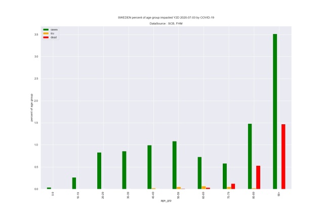
Next, let’ look at what age groups have been impacted most by Covid:

fhm_pct_age_grp_impacted


Above we have age groups of 10 year intervals. The bars show percentage Covid positive (green), ICU-care (orange) and deaths (red) per age group. For under-60, the probability of dying from Covid thus far is 0.0001 and for 70-79 0.001. Since we are looking at Covid-death-data for half a year, let’s double those numbers and we get 0.0002 vs 0.002… The average, all cause official probability for death for under 65’s is 0.001 and for 65-79 0.017, that is, a factor 10+ greater, meaning that for sure, the probability of dying increases radically by age, but Covid is far from the main cause of deaths. Not even for the very old is Covid the main cause of deaths: the official all cause death probability for 80-89 years old is 0.07, and for 90+ 0.22.

The median age for death in Sweden is 81 for men, and 85 for women. Taking that into consideration, it’s clear that a majority of those who’ve died from or with Covid, are at or above median age of death.

So the bottom line is that (very) old people do tend to die, have always done so, and very probably will always do so, but most of them die from other diseases, not from covid: cancer and heart & lung-diseases being the prime killers, which you can read more about here.

In very many of the “covid-deaths”, covid has been the “final of thousand cuts”, that is, a very old person with an already fragile “system” that is unable to handle *any* extra stress, be it from covid, influenza, or a dog bite.

So what about age adjusted and population adjusted deaths…?

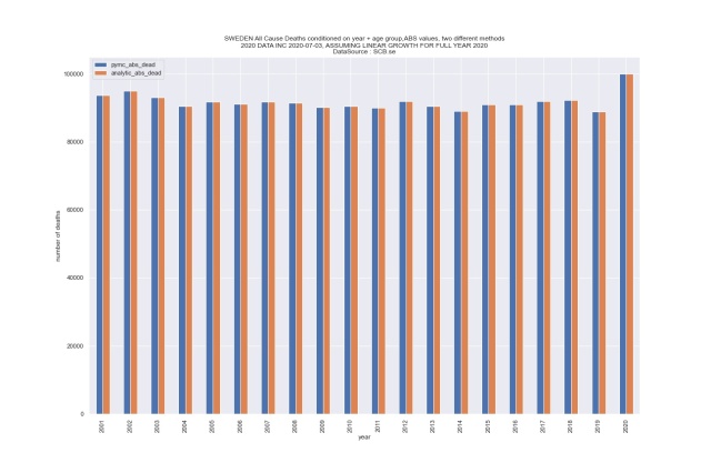
Let’s start with looking at absolute death numbers, all causes, by age group, and in what follows, I’ve made the (simplistic!) assumption that full year 2020 deaths will grow proportionally with same rate as from Jan 1st to July 3d, that is, my assumption (unrealistic!) is that the 2020 total death toll will be basically 2x the current half year death toll (which, as we recall, includes the very high number of deaths in April):

age_adj_abs_numbers_age_grp_1


So, iff the current number of all cause deaths will double from now until end of year, 2020 will indeed have the highest mortality, in absolute numbers, that is, not taking neither population size nor age demographics into account, of this period, 2001 – 2020.

Just for fun, in addition to the ‘counting’ method used to produce the above graph, I hacked a Bayesian General Linear Model on the same data, and compared the analytically obtained numbers with the statistically inferred results of the model:

pymc_cond_year_age_abs


Here, the blue bars come from the Bayesian Model (with 25 params! , and the orange bars from the “analytic” method (2010 as standard population), that is, basic arithmetic, i.e multiplying the age specific death rates with age specific population sizes. A very close match, indeed.

And finally, let’s condition on both age and population size with both methods, and see what we get:
pymc_cond_year_age_per_M


Again, both methods for calculating the deaths are extremely close.

As for what we really are interested in here, that is, how bad is 2020 in terms of total deaths compared to the years 2001..2019, under the assumption that 2020 total death toll will be 2x half year death toll…? Turns out that 2020 will not be very special at all. Despite all the hysteria, all the panic, and all the modeling “experts” that already have been proven wrong by orders of magnitude.

So… My conclusion….? If it hasn’t been made obvious by now, I’ll just say that I’m flabbergasted and disgusted over the hysteria and panic that Media and other alarmists have brought upon the world. Thus far there exists no evidence that would support the global panic and the extreme and devastating actions taken by most countries – measures that are going to destroy far more lives than the virus itself, over a foreseeable future.

Your turn.
 
Whats the use. Nobody is listening.
They have now come up with a very ferocious super infectious new covid type to scare everyone even more.
 
Now another exaggeration n ammo for the powers that be to scare the populace n sell news. Its basically saying if u recover from flu. U wont get flu again.

 
Back
Top