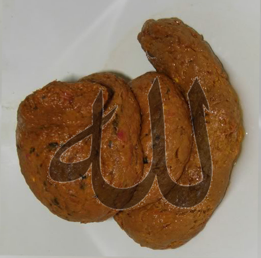

What do you think, readers? To me, the resemblance is indeed striking. Yes, the swirly cone on the label, when rotated 90 degrees to the left, the way it is in that picture, really does say Allah.
There are four letters in the word allah as it’s written: alif, laam, laam (again, with a shaddah on top), and haa’. Here are those four letters, all by themselves (remember, Arabic is written right-to-left, so the first letter is the rightmost one):
أ ل ل ه
Arabic is always written in what we’d call “cursive” style. Some of the letters have special rules about whether they can be directly attached to the letters that come before or after them. Here’s what the word allah looks like:
أﻠﻟﻪ
There should be a shaddah on top of the second laam (the shaddah is a diacritical mark which indicates that the letter it sits on top of is doubled), with what’s called a “defective alif” on top of that. You’re just going to have to take my word for it here, readers. See the picture on the right, with the word allah embossed on that golden seal or signet or whatever it is? That’s got the shaddah and the “defective alif.”
The other diacritical marks on the signet? From right to left, we’ve got (1) a fatHa, which represents the short vowel “a,” (2) the shaddah/defective alif I just mentioned, and finally (3) a dhamma, which represents the short vowel “u.” In most printed works, the short vowels are omitted (the admirable regularity of Arabic morphology and syntax makes the vowel patterns predictable, believe it or not).
That makes the word on the signet, technically, allahu, or “God [DEF, NOM]” (i.e. the noun is marked for definiteness and nominative case).
Now, on the ice-cream label, the initial “letter” alif is connected to the laam which follows it. In “real life,” the letter alif in “initial” or “medial” position doesn’t get connected to the letter that follows it, so it’s “wrong” in that respect. I cannot claim any kind of authority on Arabic calligraphy, but I believe that this would not be considered a show-stopper if you were trying to write in a fancy style.
Does any of this matter? Should the cones have been banned? Is this another example of the liberal, cowardly West succumbing to “dhimmitude”?